Mastering Animated Character Design: Tips & Techniques

Founder
© 2025 MightyGiant
© 2025 MightyGiant

Jonny
Jonny
Founder
Great animation character design is about more than drawing someone who looks appealing. It is the process of creating a character who can move, emote, communicate personality, and support the story from the first sketch to the final frame.
Whether you are working on a short film, game, advert, explainer, or social animation, the strongest designs are clear, memorable, and practical to animate.
Great animation character design is about more than drawing someone who looks appealing. It is the process of creating a character who can move, emote, communicate personality, and support the story from the first sketch to the final frame.
Whether you are working on a short film, game, advert, explainer, or social animation, the strongest designs are clear, memorable, and practical to animate.
An animated character works when the audience understands who they are before they say a word. Shape, posture, proportions, costume, colour, facial features, and movement potential all combine to create an instant impression. Good character design and animation should feel connected: the design suggests how the character behaves, and the animation proves it through motion.
A shy character might have a closed silhouette, rounded shoulders, and small, cautious gestures. A confident hero may stand tall, use bold shapes, and move with direct, open energy. These choices are not random decoration. They help the viewer read personality quickly, which is especially important in animation where every second of screen time matters.
An animated character works when the audience understands who they are before they say a word. Shape, posture, proportions, costume, colour, facial features, and movement potential all combine to create an instant impression. Good character design and animation should feel connected: the design suggests how the character behaves, and the animation proves it through motion.
A shy character might have a closed silhouette, rounded shoulders, and small, cautious gestures. A confident hero may stand tall, use bold shapes, and move with direct, open energy. These choices are not random decoration. They help the viewer read personality quickly, which is especially important in animation where every second of screen time matters.
Before you refine hair, clothing, markings, or accessories, define the role the character plays. A beautiful design can still fail if it does not serve the story, genre, or audience. Ask what the character wants, what stops them getting it, and how they change across the piece.
This is where character development ideas become useful. Even a simple mascot or background character benefits from a short internal profile. You do not need a full novel-length backstory, but you do need enough information to make consistent design choices.
Helpful starting points include:
Role in the story: Are they the lead, guide, rival, comic relief, mentor, or obstacle?
Core personality: Are they curious, chaotic, precise, nervous, bold, gentle, proud, or playful?
Emotional range: What expressions and moods will they need to show on screen?
Physical behaviour: Do they move quickly, heavily, smoothly, awkwardly, or unpredictably?
World and context: Do they belong in fantasy, sci-fi, comedy, education, horror, or a brand-led setting?
Audience expectation: Is the design aimed at children, adults, families, learners, players, or customers?
Once these basics are clear, the visual design has direction. A character made for slapstick comedy may need flexible proportions and readable expressions. A character in a serious cinematic drama may need subtler facial structure and more restrained exaggeration.
Before you refine hair, clothing, markings, or accessories, define the role the character plays. A beautiful design can still fail if it does not serve the story, genre, or audience. Ask what the character wants, what stops them getting it, and how they change across the piece.
This is where character development ideas become useful. Even a simple mascot or background character benefits from a short internal profile. You do not need a full novel-length backstory, but you do need enough information to make consistent design choices.
Helpful starting points include:
Role in the story: Are they the lead, guide, rival, comic relief, mentor, or obstacle?
Core personality: Are they curious, chaotic, precise, nervous, bold, gentle, proud, or playful?
Emotional range: What expressions and moods will they need to show on screen?
Physical behaviour: Do they move quickly, heavily, smoothly, awkwardly, or unpredictably?
World and context: Do they belong in fantasy, sci-fi, comedy, education, horror, or a brand-led setting?
Audience expectation: Is the design aimed at children, adults, families, learners, players, or customers?
Once these basics are clear, the visual design has direction. A character made for slapstick comedy may need flexible proportions and readable expressions. A character in a serious cinematic drama may need subtler facial structure and more restrained exaggeration.
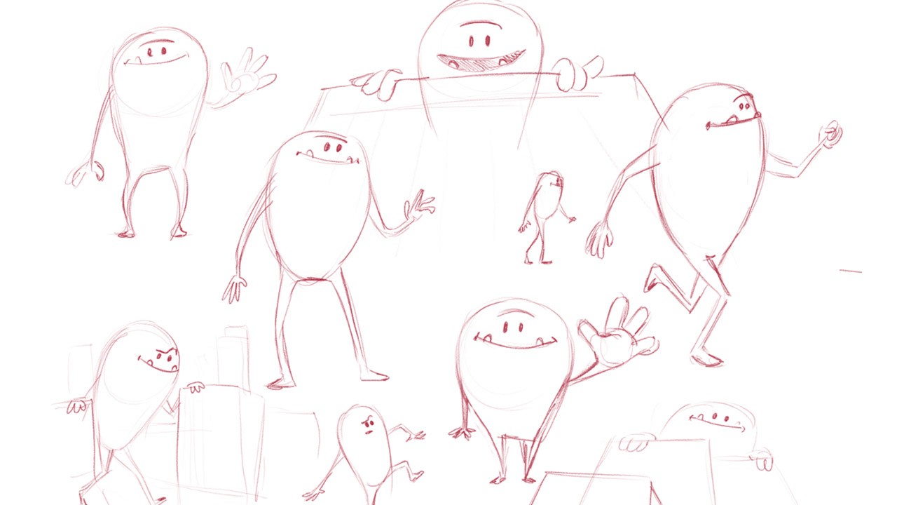
A strong silhouette means the character can be recognised even as a flat black shape. This is one of the most practical character design tips because it directly affects readability. If the audience cannot tell characters apart at a glance, the design may need clearer shape language.
Work in broad forms before small details. Try reducing the character to their head shape, body mass, stance, and key accessories. If two characters have similar height, hair, clothing, and posture, they may blur together in motion. Adjust proportions, spacing, and outline so each design has its own identity.
Shape language also carries emotional meaning. Round forms often feel soft, friendly, young, or approachable. Square forms can suggest strength, steadiness, stubbornness, or reliability. Sharp triangular forms may feel energetic, dangerous, elegant, or mischievous depending on how they are used.
A useful exercise is to create three silhouette versions of the same character:
A safe version that follows the obvious idea.
An exaggerated version that pushes proportions and posture.
An unexpected version that challenges your first assumptions.
The best final design often sits between clarity and surprise.
A strong silhouette means the character can be recognised even as a flat black shape. This is one of the most practical character design tips because it directly affects readability. If the audience cannot tell characters apart at a glance, the design may need clearer shape language.
Work in broad forms before small details. Try reducing the character to their head shape, body mass, stance, and key accessories. If two characters have similar height, hair, clothing, and posture, they may blur together in motion. Adjust proportions, spacing, and outline so each design has its own identity.
Shape language also carries emotional meaning. Round forms often feel soft, friendly, young, or approachable. Square forms can suggest strength, steadiness, stubbornness, or reliability. Sharp triangular forms may feel energetic, dangerous, elegant, or mischievous depending on how they are used.
A useful exercise is to create three silhouette versions of the same character:
A safe version that follows the obvious idea.
An exaggerated version that pushes proportions and posture.
An unexpected version that challenges your first assumptions.
The best final design often sits between clarity and surprise.
Animation art styles should support the tone, production method, and emotional goal of the project. A highly detailed painterly character may look impressive, but it can become difficult to animate consistently. A very simple geometric design may be efficient, but it still needs personality and appeal.
Common style directions include:
Cartoon and stylised: Great for expressive acting, comedy, educational content, and bold visual identity.
Semi-realistic: Useful for stories that need emotional nuance while still allowing controlled exaggeration.
Graphic and minimalist: Effective for explainer videos, brand animation, apps, and motion graphics.
Anime-inspired: Often strong for dynamic poses, expressive eyes, dramatic action, and distinct genre cues.
Painterly or textured: Suitable for atmospheric storytelling, premium campaign work, or handcrafted visual worlds.
3D stylised: Helpful when characters need volume, repeatable performance, and camera flexibility.
The key is not to pick a style because it is fashionable. Choose one that fits the story, timeline, budget, team skills, and where the animation will be viewed. A mobile-first social clip, for example, needs bold readability at small sizes, while a cinematic short can hold more subtle detail.
Animation art styles should support the tone, production method, and emotional goal of the project. A highly detailed painterly character may look impressive, but it can become difficult to animate consistently. A very simple geometric design may be efficient, but it still needs personality and appeal.
Common style directions include:
Cartoon and stylised: Great for expressive acting, comedy, educational content, and bold visual identity.
Semi-realistic: Useful for stories that need emotional nuance while still allowing controlled exaggeration.
Graphic and minimalist: Effective for explainer videos, brand animation, apps, and motion graphics.
Anime-inspired: Often strong for dynamic poses, expressive eyes, dramatic action, and distinct genre cues.
Painterly or textured: Suitable for atmospheric storytelling, premium campaign work, or handcrafted visual worlds.
3D stylised: Helpful when characters need volume, repeatable performance, and camera flexibility.
The key is not to pick a style because it is fashionable. Choose one that fits the story, timeline, budget, team skills, and where the animation will be viewed. A mobile-first social clip, for example, needs bold readability at small sizes, while a cinematic short can hold more subtle detail.
Design a character that is easy to animate by simplifying what must move and clarifying what matters most. Every extra strap, curl, texture, fold, pattern, or accessory has to be drawn, rigged, tracked, or managed across frames. Detail is not the enemy, but uncontrolled detail can slow production and distract from performance.
Think like an animator while you design. Can the arms cross the body without confusing the silhouette? Can the mouth make the expressions required by the script? Can the eyes show emotion clearly? Can the costume bend, squash, stretch, or rotate without breaking the visual logic?
For 2D animation, line economy matters. Clean, confident shapes are easier to redraw consistently. For 3D animation, topology, joints, and rigging requirements become important. For cut-out or puppet animation, the design must break into usable parts without looking stiff.
A practical checklist:
Keep the most important features readable from a distance.
Avoid tiny repeated details unless they are essential.
Make facial features large enough to support emotion.
Check that hands, eyes, and mouth can perform clearly.
Test the design in key poses before finalising it.
Consider how hair, clothing, tails, wings, or props will move.
Remove anything that looks good in one pose but fails in motion.
A character should look appealing in a still image, but it must survive movement. That is the difference between illustration and animation character design.
Design a character that is easy to animate by simplifying what must move and clarifying what matters most. Every extra strap, curl, texture, fold, pattern, or accessory has to be drawn, rigged, tracked, or managed across frames. Detail is not the enemy, but uncontrolled detail can slow production and distract from performance.
Think like an animator while you design. Can the arms cross the body without confusing the silhouette? Can the mouth make the expressions required by the script? Can the eyes show emotion clearly? Can the costume bend, squash, stretch, or rotate without breaking the visual logic?
For 2D animation, line economy matters. Clean, confident shapes are easier to redraw consistently. For 3D animation, topology, joints, and rigging requirements become important. For cut-out or puppet animation, the design must break into usable parts without looking stiff.
A practical checklist:
Keep the most important features readable from a distance.
Avoid tiny repeated details unless they are essential.
Make facial features large enough to support emotion.
Check that hands, eyes, and mouth can perform clearly.
Test the design in key poses before finalising it.
Consider how hair, clothing, tails, wings, or props will move.
Remove anything that looks good in one pose but fails in motion.
A character should look appealing in a still image, but it must survive movement. That is the difference between illustration and animation character design.
Colour is one of the fastest ways to communicate mood, status, and contrast. It can show whether a character feels warm, mysterious, energetic, calm, artificial, natural, heroic, or unsettling. It also helps the audience track characters across busy scenes.
Start with a limited palette. Too many colours can make a design noisy, particularly once backgrounds, lighting, effects, and motion enter the frame. Choose a dominant colour, one or two supporting colours, and a controlled accent. The accent can be especially useful for drawing attention to the face, hands, emblem, weapon, or story object.
Also test colour against the world. A green character may disappear in a forest setting. A dark costume may lose detail in night scenes. A pastel palette may need stronger value contrast if the animation will be watched on small screens.
Value matters as much as hue. Convert your character to greyscale and check whether the design still reads. If the face, torso, and accessories all blend into one tone, the viewer may struggle to follow the acting.
Colour is one of the fastest ways to communicate mood, status, and contrast. It can show whether a character feels warm, mysterious, energetic, calm, artificial, natural, heroic, or unsettling. It also helps the audience track characters across busy scenes.
Start with a limited palette. Too many colours can make a design noisy, particularly once backgrounds, lighting, effects, and motion enter the frame. Choose a dominant colour, one or two supporting colours, and a controlled accent. The accent can be especially useful for drawing attention to the face, hands, emblem, weapon, or story object.
Also test colour against the world. A green character may disappear in a forest setting. A dark costume may lose detail in night scenes. A pastel palette may need stronger value contrast if the animation will be watched on small screens.
Value matters as much as hue. Convert your character to greyscale and check whether the design still reads. If the face, torso, and accessories all blend into one tone, the viewer may struggle to follow the acting.
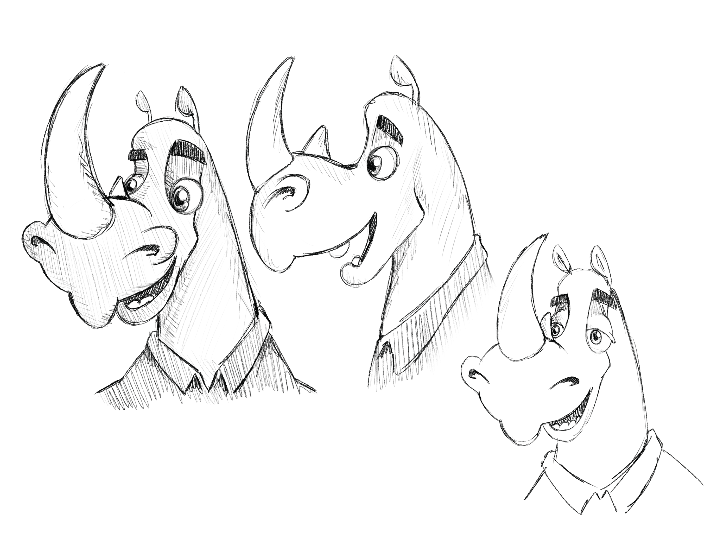
Expression is where the audience connects. Even non-human characters need a clear system for emotion, whether that comes through eyes, posture, ears, antennae, eyebrows, body squash, or timing. If the design can only show one attractive neutral pose, it is not ready for animation.
Create an expression sheet with the emotions the project actually needs. For many characters, this includes joy, fear, anger, sadness, surprise, confusion, determination, and embarrassment. Do not just change the mouth. Explore how the whole face and body respond.
Body language should be just as specific. A tired character does not simply frown; they may sag, blink slowly, drag their feet, or hold their head forward. An excited character may lift their chest, widen their stance, and move in quicker rhythms. These physical details make performance feel alive.
Expression is where the audience connects. Even non-human characters need a clear system for emotion, whether that comes through eyes, posture, ears, antennae, eyebrows, body squash, or timing. If the design can only show one attractive neutral pose, it is not ready for animation.
Create an expression sheet with the emotions the project actually needs. For many characters, this includes joy, fear, anger, sadness, surprise, confusion, determination, and embarrassment. Do not just change the mouth. Explore how the whole face and body respond.
Body language should be just as specific. A tired character does not simply frown; they may sag, blink slowly, drag their feet, or hold their head forward. An excited character may lift their chest, widen their stance, and move in quicker rhythms. These physical details make performance feel alive.
Consistency is essential, especially when several artists or animators are involved. A character can be expressive without changing into a different person every time they turn their head. Model sheets, turnaround drawings, proportion guides, and pose references help everyone maintain the same design logic.
Useful guide materials include:
Front, side, three-quarter, and back views.
A height chart if the character appears with others.
Facial expression sheets.
Hand and prop references.
Key action poses.
Notes on what can and cannot change.
Colour codes or palette references where needed.
These assets are not just admin. They protect the quality of the animation and reduce avoidable revisions. When the rules are clear, artists have more freedom to focus on performance rather than guessing how a character should look from frame to frame.For a website animation, a team may look at engagement with the page, scroll behavior, clicks to the next step, or whether visitors spend more time with key product information. For sales enablement, feedback from sales teams may reveal whether prospects understand the offer faster. For product education, teams may watch for fewer repeated explanations or smoother onboarding conversations.
The important point is to define success before production. A playful animation made to drive awareness should not be judged only by direct conversions. A technical explainer should not be evaluated only by visual style. Match the measurement to the mission.
Consistency is essential, especially when several artists or animators are involved. A character can be expressive without changing into a different person every time they turn their head. Model sheets, turnaround drawings, proportion guides, and pose references help everyone maintain the same design logic.
Useful guide materials include:
Front, side, three-quarter, and back views.
A height chart if the character appears with others.
Facial expression sheets.
Hand and prop references.
Key action poses.
Notes on what can and cannot change.
Colour codes or palette references where needed.
These assets are not just admin. They protect the quality of the animation and reduce avoidable revisions. When the rules are clear, artists have more freedom to focus on performance rather than guessing how a character should look from frame to frame.For a website animation, a team may look at engagement with the page, scroll behavior, clicks to the next step, or whether visitors spend more time with key product information. For sales enablement, feedback from sales teams may reveal whether prospects understand the offer faster. For product education, teams may watch for fewer repeated explanations or smoother onboarding conversations.
The important point is to define success before production. A playful animation made to drive awareness should not be judged only by direct conversions. A technical explainer should not be evaluated only by visual style. Match the measurement to the mission.
The best character design tips all point towards the same idea: make every choice earn its place. Shape, colour, costume, expression, and movement potential should work together rather than compete for attention. A memorable character is not always the most detailed one; it is often the one with the clearest visual idea.
Strong character design and animation begin with understanding. Know the story, know the audience, know the style, and know how the character needs to perform. From there, sketch widely, test honestly, simplify where needed, and refine until the design feels both distinctive and usable.
If you approach the process with that balance of imagination and practicality, your characters will do more than look good. They will feel alive on screen, support the story, and stay with the audience after the animation ends.
The best character design tips all point towards the same idea: make every choice earn its place. Shape, colour, costume, expression, and movement potential should work together rather than compete for attention. A memorable character is not always the most detailed one; it is often the one with the clearest visual idea.
Strong character design and animation begin with understanding. Know the story, know the audience, know the style, and know how the character needs to perform. From there, sketch widely, test honestly, simplify where needed, and refine until the design feels both distinctive and usable.
If you approach the process with that balance of imagination and practicality, your characters will do more than look good. They will feel alive on screen, support the story, and stay with the audience after the animation ends.
Could your product be helped by some of the design here. We'd love to hear more about your brand and help you give it some motion and animation.
Could your product be helped by some of the design here. We'd love to hear more about your brand and help you give it some motion and animation.