Lumière Drops: From Shot List to Style Frame
Product shots. R&D and textures
3D Designer
Product shots. R&D and textures
3D Designer
Being Giant doesn't always mean delivering to a client. Sometimes it means sitting down, doing the work, and getting better at the craft.
Creative director Jordan kept this brief simple. Pick a product and focus purely on the craft. Shot logic, pacing, timing to music, cuts, transitions, camera and lens. All of it explored through simple geometry with no lighting to distract from the fundamentals.
The product itself was something we made up. Lumière Drops, a glass dropper bottle. A fictional brand, a real exercise. Because the product was almost beside the point. What mattered was the shot language. How does the camera move? Where do cuts land? How do you use shape and motion to pull the viewer through a story without them noticing the edit?
A shot list came first. Energetic introduction, close look, a moment of uniqueness, an attracting detail, diving into the form, transitioning inside the bottle, all the way down to the molecules. Each shot had a purpose.
A few variations later, Jordan reviewed the work and pushed it further, pointing out transitions and animation possibilities that had been left on the table. That back and forth is the whole thing. Simple process, better work.
With the exercise done, the task moved to style frames, with a twist. The goal was to see how many strong directions could be developed in a single day. That's real world pressure. Clients don't always have weeks, and neither do we.
Honest note: a little extra time was taken to sit with it and refine. But the core thinking, the directions, the decisions, those happened fast. And that was the point.
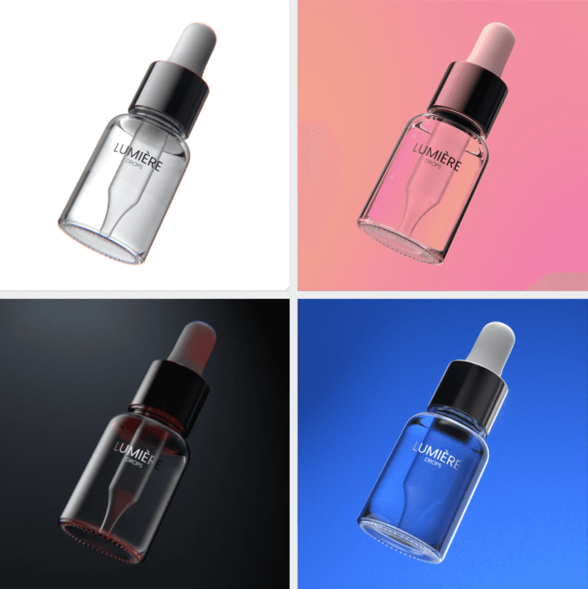
Style frames meant confronting glass, one of the most unforgiving materials in 3D. It doesn't sit still. It reacts to everything around it.
So before anything looked polished, there was a proper RND phase. Background reflections, internal illumination, gradient highlights, GOBO behaviour, refraction, IOR, every variable tested and understood in Blender. Tendril Studio's work guided the visual ambition. There was also a quick test done in C4D, just to see how the material and lighting would translate across software since it's been on the learning list for a while. But Blender was home base throughout.
Every test was asking the same question: where does the light need to be, and why?
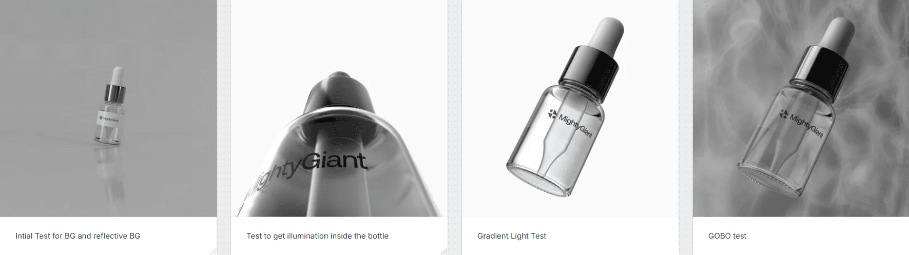
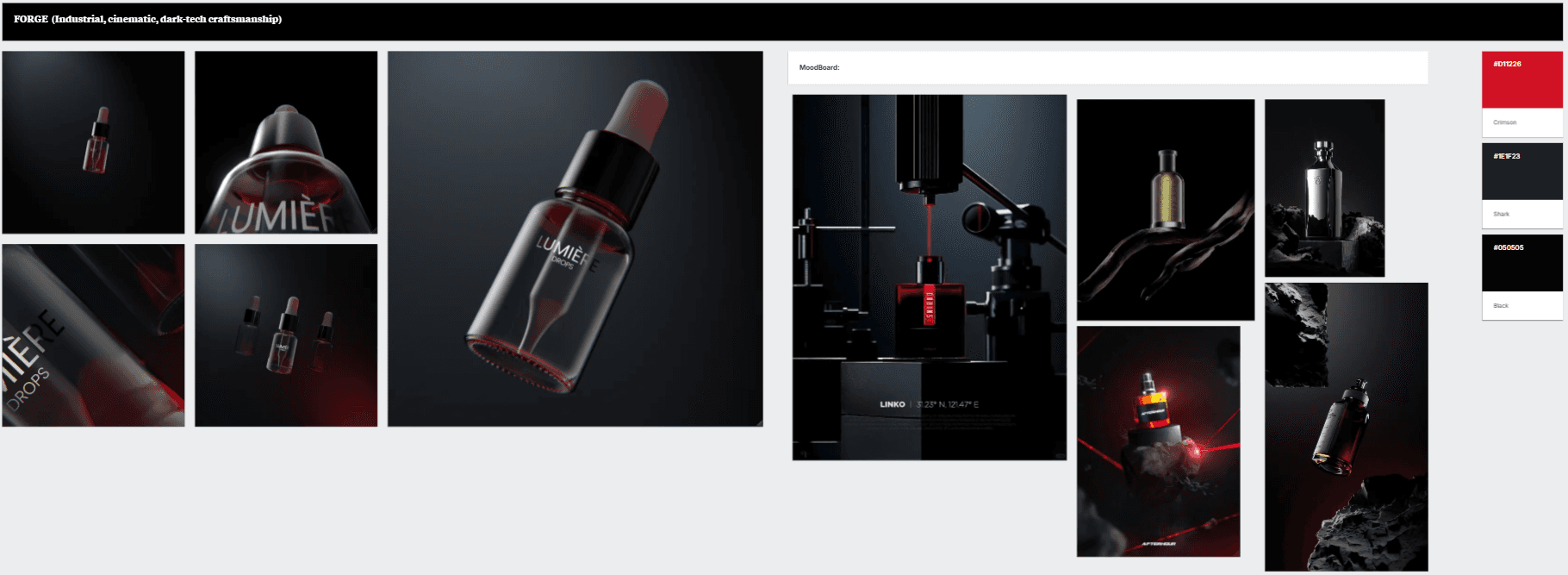
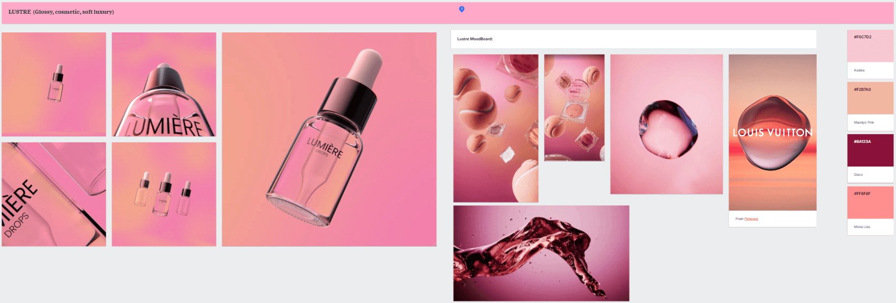
From all that groundwork, four distinct directions came through.
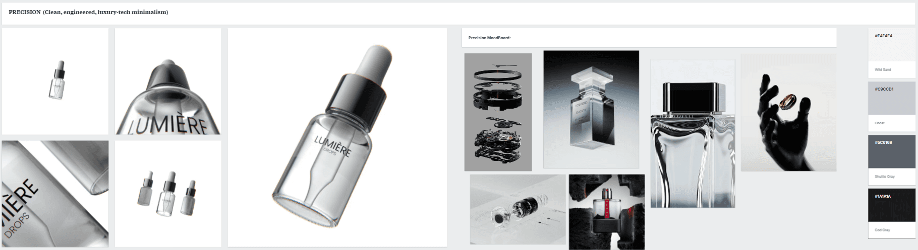
Precision is monotone, controlled, luxury-tech minimalism. Cool greys and clean light. Confident and quiet.
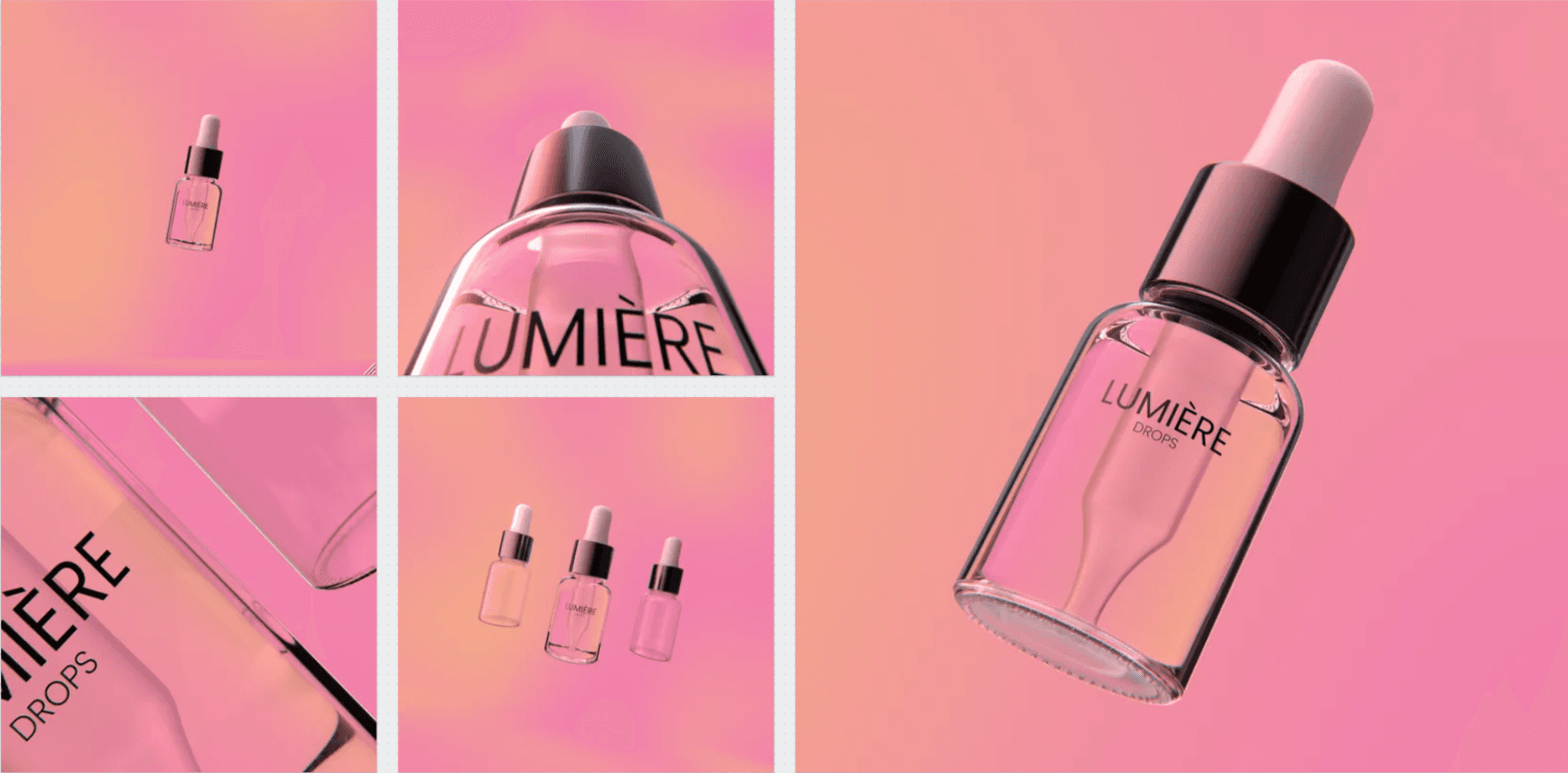
Lustre is soft, glossy and warm. Pinks and blush tones with the IOR tuned to bring out those dark defining edges that make glass look expensive.
Forge goes dark and cinematic. Red highlights cutting through near-black with an industrial energy.
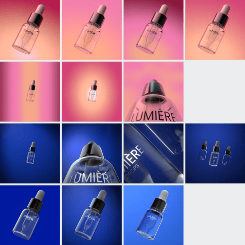
Brand puts electric blue front and centre. Colour-led and bold, built for a brand that knows exactly who it is.
Four options because a client's instinct usually falls into one of four places. White, dark, colourful, or brand colour. Put all four in front of them and the conversation gets a lot simpler. That's the MightyGiant way.
This is a practice exercise, but the thinking behind it is the same thinking we bring to every project. Understand the brief. Do the groundwork. Make the process simple. Let the work do the talking.
Being Giant starts here.
Could your product be helped by some of the design here. We'd love to hear more about your brand and help you give it some motion and animation.
© 2026 MightyGiant. All rights reserved.